How Malgudi Arts Lifts Cart Value by 32% with BOB's Buy X, Get Y Bundles
🐘 How Malgudi Arts Lifts Cart Value by 32% with BOB's Buy X, Get Y Bundles
How a devotional and gifting brand grew average order value by adding a second bronze piece to the cart — at a discount on the add-on, never on the hero product — and closed the loop with a cart drawer built for Indian shoppers.
On this page
- 1. One elephant is beautiful. Two tell a story.
- 2. Meet Malgudi Arts
- 3. A catalog that belongs in sets, sold one piece at a time
- 4. The first pillar — Buy X, Get Y, explained plainly
- 5. What the offer looks like in practice
- 6. The second pillar — the cart drawer that closes the loop
- 7. The math, cleanly
- 8. Why this matters beyond brass and bronze
- 9. Two pillars, one app, zero theme code
- 10. Run a catalog like this? Try BOB.
1. One Elephant Is Beautiful. Two Tell a Story.
In Malgudi Arts' category, almost every piece looks better in a pair, a set, or a curated arrangement. A pair of elephants is auspicious. Deer come in pairs. Owls are gifted as companions. Deities rarely stand alone on a mantle. The aesthetic grammar of the category — devotional, spiritual, home decor, gifting — is built around groupings, not singles.
And yet the default behaviour on a Shopify store is to sell one piece at a time. A shopper lands on a product page, picks the one they came for, and checks out. The catalog may be full of natural pairings, but the product page doesn't know that, and the shopper doesn't have a reason to look past the item they've already chosen.
This is the gap Malgudi Arts closed — not by discounting what the shopper came for, but by making the next piece the easier choice.
2. Meet Malgudi Arts
Malgudi Arts designs and sells handcrafted brass and bronze pieces across devotional, spiritual, meditation, home decor, and gifting categories. The buyers aren't impulse shoppers. They're picking pieces for a puja room, a meditation corner, a wedding gift, a housewarming, or simply a thoughtful addition to a space they care about.
That has consequences for how the store has to behave. Tone matters as much as price. A buyer who feels pressured doesn't just abandon the cart — they leave with a worse impression of the brand than when they arrived. Any conversion tactic that works here has to respect the weight of the purchase.
3. A Catalog That Belongs in Sets, Sold One Piece at a Time
The mismatch is simple, but it's the whole story.
A shopper looking at a Pair of Elephants on Malgudi Arts' store doesn't necessarily realise that the Deer Pair in the next collection would complete a gifting set. A buyer eyeing a single Owl figurine doesn't think to add a second piece, even though two would ship as a better gift. And asking a shopper to "browse more" after they've already decided to buy is asking them to break out of the flow they're in — which most won't do.
So the question for a retailer in this category isn't "how do we discount the Elephants to close the sale?" The Elephants are going to sell. The question is: how do we get a second piece into that cart without touching the first one's price? And once the shopper has added it, how do we make sure they don't drop off between offer and checkout?
Those are two problems, not one. Malgudi Arts uses BOB to solve both — with Buy X, Get Y bundles on the product page, and a cart drawer built to close the loop.
4. The First Pillar — Buy X, Get Y, Explained Plainly
Before walking through what this looks like on the store, it's worth naming the mechanic clearly, because it's subtler than it appears.
Buy X, Get Y is a targeted upsell. The shopper is buying an anchor product — X, in this case the Pair of Elephants at Rs. 4,999. BOB offers them a second product — Y, the Deer Pair — at an exclusive discount, only available if they buy it alongside X. The Deer Pair is Rs. 1,999 on its own; bought with the Elephants, it's Rs. 1,599.20. A clean 20% off, but only on the add-on.
Three details make the mechanic land:
The discount applies only to Y. The Elephants never see a price cut. That's deliberate — the hero product stays at full margin, and the discount becomes a surgical tool aimed at growing the cart, not a blanket markdown.
The offer is contextual, not sitewide. The Deer Pair bundle shows up on the Elephants' product page. Not as a banner. Not as a homepage promo. Only at the moment a shopper is actually considering the anchor product — which is when the pairing makes sense.
The discount is auto-applied at checkout. No coupon code. No "use this at the next step." The shopper clicks once, both items land in the cart with the bundle price locked in, and the store doesn't ask them to earn the discount they were just offered.
Each of these decisions sounds small. Stacked together, they're the difference between a bundle that feels like a helpful suggestion and a bundle that feels like a hoop to jump through.
5. What the Offer Looks Like in Practice
On Malgudi Arts' product page for the Pair of Elephants, BOB surfaces a "You may also like this…" card directly below the Buy Now button. It's unobtrusive — it sits where the shopper's eye is already going, and it doesn't interrupt the primary CTA — but once you look at it, the mechanics are visible at a glance.
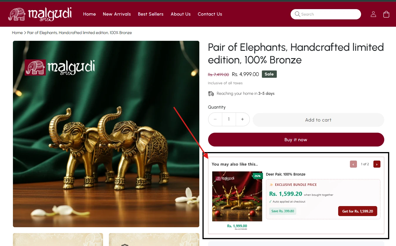
The card shows the Deer Pair, a 26% discount badge on the image, and an "Exclusive Bundle Price" headline: Rs. 1,599.20 when bought with the Elephants. Below it, a quiet reassurance — "Auto applied at checkout" — and a clear callout of what the shopper saves: "Save Rs. 399.80." A single-click "Get for Rs. 1,599.20" CTA completes the card. One click, both items in the cart, discount locked in.
A closer look makes the anatomy of the offer clearer:
The framing matters as much as the mechanics. "You may also like this…" is conversational. "When bought together" reframes the discount as a reward for completing a set — not a price cut on a lonely product trying to move inventory. For a category where hard selling would feel discordant, this tone is doing quiet but essential work.
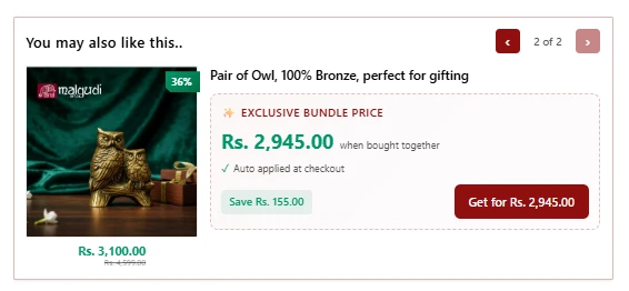
The "1 of 2" pagination on the card is a small detail with a specific intent: BOB isn't throwing a wall of cross-sells at the shopper. It's showing two hand-picked pairings — Deer or Owl — each one a thoughtful set completion. The shopper gets choice without being overwhelmed by a grid of recommendations. Either bundle is a win for cart value. Neither feels like pressure.
6. The Second Pillar — The Cart Drawer That Closes the Loop
If the PDP's job is to make the offer, the cart drawer's job is to make sure the shopper doesn't lose the plot between "Add to Cart" and "Pay." This is the moment where most stores quietly leak conversions — the shopper opens the cart, checks the total, hesitates about payment, and closes the tab.
Malgudi Arts' cart drawer is built to hold the shopper's attention through exactly that moment. It's doing five things at once, and each one matters.
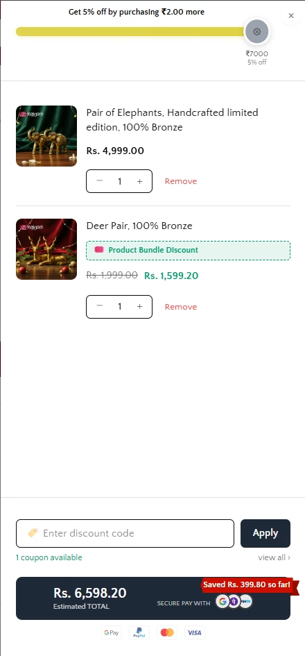
The bundle discount is visibly applied and attributed. The Deer Pair line item shows Rs. 1,999 struck through, Rs. 1,599.20 in green, and a "Product Bundle Discount" tag right under the product name. The saving isn't hidden in the total — it's attached to the specific product that earned it. The shopper sees exactly where the discount came from, which makes the deal feel real instead of generic.
A threshold nudge sits at the top of the drawer. A progress bar reads "Get 5% off by purchasing ₹2.00 more," with a yellow bar nearly filled and a tier indicator showing ₹7000 · 5% off. The shopper has just accepted one bundle and is — literally — two rupees away from a second discount. Few people close a tab two rupees short of a reward. The threshold offer stacks a second AOV lever on top of the first, without feeling like a separate ask.
A real-time savings reinforcement appears beside the total. A red "Saved Rs. 399.80 so far!" flag sits in the corner next to the estimated total of Rs. 6,598.20. This is a small thing that does a lot. The shopper sees the win, not just the price. Post-purchase regret — the "did I just spend too much?" feeling — gets front-run by the store confirming, visibly, that they came out ahead on this transaction.
The discount code field is present but intelligent. Instead of an empty box that trains shoppers to Google for coupon codes and abandon when they can't find one, the drawer surfaces "1 coupon available" with a "view all ›" link. Applicable discounts are brought to the shopper; they don't have to leave to find them. This is a small but meaningful reversal of a very old friction point.
And the payment stack is localised for Indian buyers. Under a "SECURE PAY WITH" label, the drawer displays icons for GPay, PayPal, Mastercard, and Visa, with additional UPI and netbanking options (PhonePe, Paytm, Net Banking) clustered nearby. For an Indian ecommerce brand, this isn't decoration — it's a trust signal. UPI is how most of India pays. A buyer looking at a Rs. 6,598 cart needs to see GPay or PhonePe early in the flow, or they may assume the store doesn't support how they actually pay, and bail before reaching checkout. Showing the payment stack before checkout, not after, reduces a specific, measurable form of drop-off — and it does so at the exact moment the shopper is deciding whether to commit. For Malgudi Arts, with a meaningful share of buyers in the Indian diaspora (PayPal for NRI purchases, UPI for domestic), that localisation is a conversion feature in itself.
This is where most bundle apps end — at the offer. BOB continues past it into the cart, so every decision the shopper made is reflected back to them, their next decision is already framed, and the final step (payment) feels obvious instead of risky. The cart drawer isn't a summary page. It's the third act of the sale.
7. The Math, Cleanly
It's worth putting the numbers in one place, because this is the section merchants will screenshot.
| Line item | Without BOB | With BOB (Buy X, Get Y) |
|---|---|---|
| Pair of Elephants (X) | Rs. 4,999 | Rs. 4,999 (no discount) |
| Deer Pair (Y) | — | Rs. 1,599.20 (20% off add-on) |
| Cart total | Rs. 4,999 | Rs. 6,598.20 |
| Cart value lift | — | +Rs. 1,599.20 (~32%) |
| Discount given | — | Rs. 399.80 (only on Y) |
| Hero product margin | Protected | Protected |
A ~32% lift on the eligible transaction. Zero margin erosion on the product the shopper came for. A single small discount on the add-on does all the work.
Multiply that across every eligible Buy X, Get Y transaction on the store, and you have a compounding AOV mechanic that doesn't ask the brand to cut prices on its hero products.
8. Why This Matters Beyond Brass and Bronze
Malgudi Arts sells bronze. The playbook generalises.
Any store whose catalog is set-oriented benefits from Buy X, Get Y — jewelry, candles, home decor, stationery, gifting, kitchenware, wellness, skincare. Anything where the natural unit of consumption is a pair, a trio, or a curated arrangement.
Any store whose buyers are considered, not impulsive benefits from a cart drawer that closes the loop. Threshold nudges, attributed discounts, surfaced coupons, localised payment options — these aren't tricks, they're the difference between a checkout that feels honest and one that feels like a gamble.
And any store selling into Indian shoppers benefits from a cart drawer that speaks their payment language. UPI-first. Coupon-transparent. Savings-visible.
The thread running through all of it: don't maximise clicks. Guide the decision. Offer the set completion at the moment the shopper can imagine it, confirm the deal at the moment they commit to it, and make the final step obvious enough that they take it.
9. Two Pillars, One App, Zero Theme Code
What Malgudi Arts' setup proves is that average order value isn't something you grow by discounting — it's something you grow by sequencing the right moments.
The PDP pillar — Buy X, Get Y — does the growing. It puts a second piece in front of the shopper at the moment they're already saying yes to the first, and it does so with a discount structure that protects the hero product's margin entirely.
The cart drawer pillar does the closing. It attributes the discount so the shopper sees it, nudges toward the next tier, surfaces applicable coupons, confirms the savings, and localises trust through payment icons that match how the shopper actually pays.
Both pillars shipped without a theme edit. Both scale across the catalog as new products launch. And both compound — a bundle that gets accepted makes the cart drawer's threshold nudge more relevant, and a cart drawer that earns trust makes the next bundle more likely to land.
For any merchant running a set-oriented, emotionally-resonant, India-first catalog — or any merchant who recognises one of those descriptions in their own store — the playbook is straightforward. Let BOB handle the offer. Let BOB handle the close. Let the theme stay untouched.
10. Run a Catalog Like This? Try BOB.
If your Shopify store has products that belong together, shoppers who deliberate before they commit, or a cart experience that could do more than summarise the total — BOB was built for stores exactly like yours.
Want this guide as a PDF?
Get the complete article delivered to your inbox for easy reference and offline reading.
The Shopify Store Building Guide
Everything merchants are actually doing right now — not last year's playbook.
Mix-and-match bundles, Buy X Get Y, per-collection variant configurators, cart drawers that close the loop, community deals. One PDF. Updated this quarter with live case-study patterns.
Keep reading
How a UK Print Shop Sells Brand Kits to Startups — Using BOB's Mix-and-Match Bundles
How Discount Print Online replaced rigid packs with a 4/9/18-item bundle builder — letting startups configure their own merch mix across sizes, colours, and products, with volume-tier pricing that rewards the trade up.
RelatedHow SMKHelmets.IN Runs a 400+ Variant Shopify Catalog with BOB
How a leading helmet brand scaled 20+ collections, per-collection size charts, image-based variant selection, and AI-powered recommendations on Shopify — without touching a line of theme code.